This picture nicely demonstrates a silver medal winning tripod placement. As you can see, each of the three legs rests on a different plane, none of which is the ground, floor, or decking. Obviously, had the three legs also landed on different materials (like stone, wood, dirt, etc.) we’d probably be looking at a gold medal winner. Difficulty points were awarded for leg extension, but anyone familiar with these monster Gitzos knows that there’s still almost two sections in that left leg.
Meeting in the middle - So cell phones are becoming more like computers and, at least in the labs of Google, computers are becoming more like cell phones. I’m curious to see where these trend lines will converge.
Andrew Zuckerman:Bird - found via Kottke.
Amazingly sharp, detailed photographs. I watched the behind the scenes video with interest and discovered that these pictures were taken with a medium format digital back that is similar to what I use (Leaf Aptus, but not sure what model he’s using). Impressive considering that medium format cameras are not known for being nimble creatures. There must have been countless throw-away missed shots, but the payoff is right there on the page.
Mark Weaver - found via Grain Edit.
From his ongoing “Make Something Cool Every Day” illustration project.
Ryan on the road - photographed October, 2009
Design Marathon
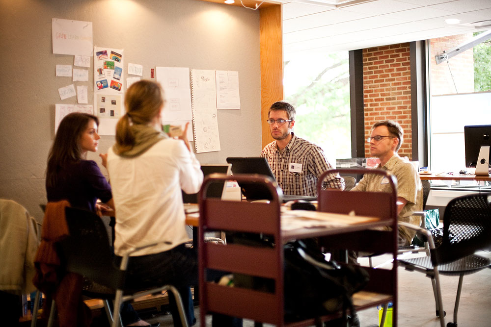
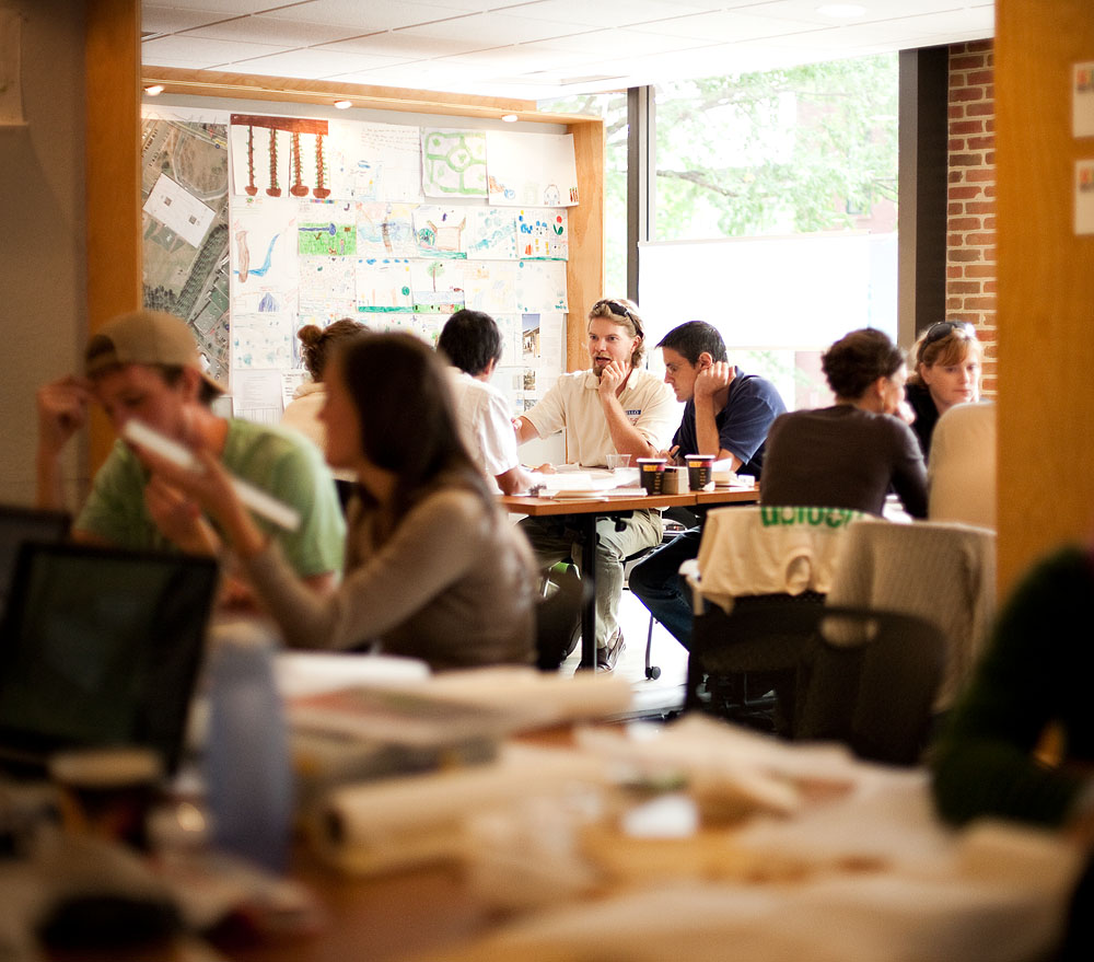
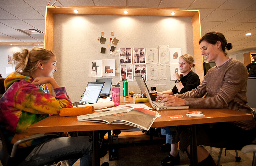
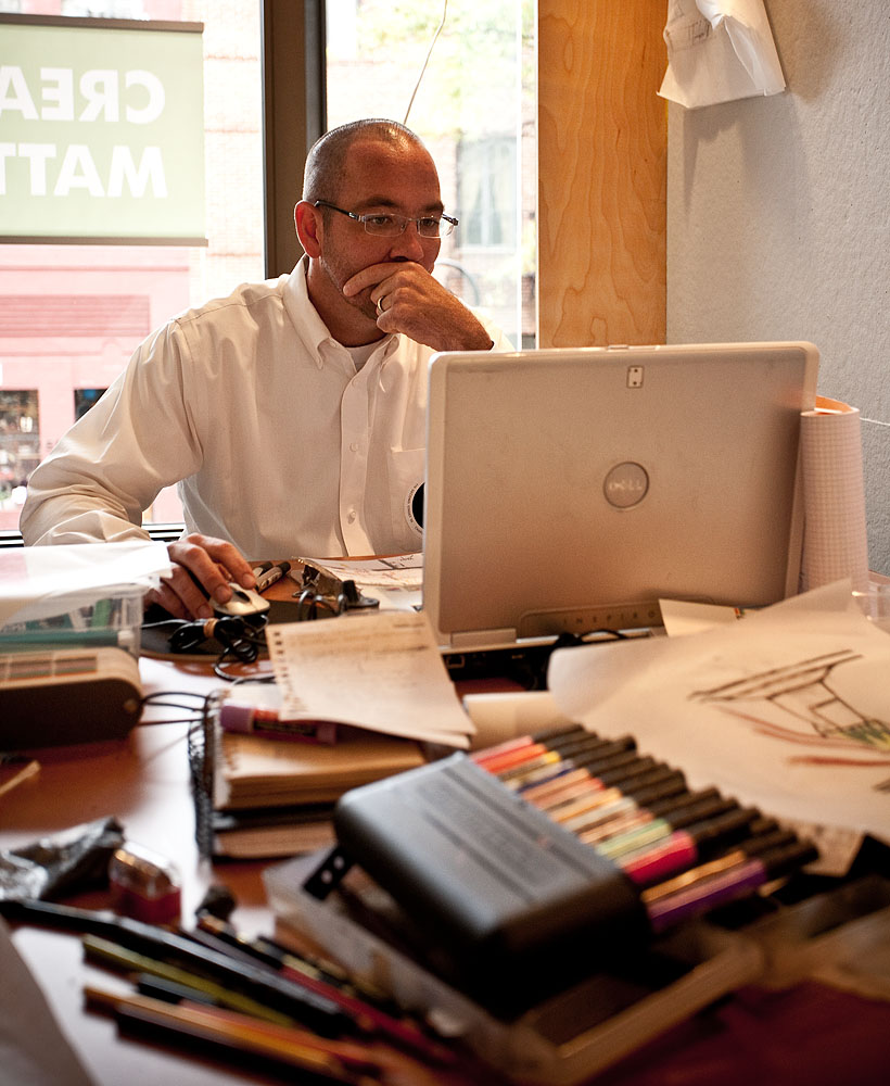
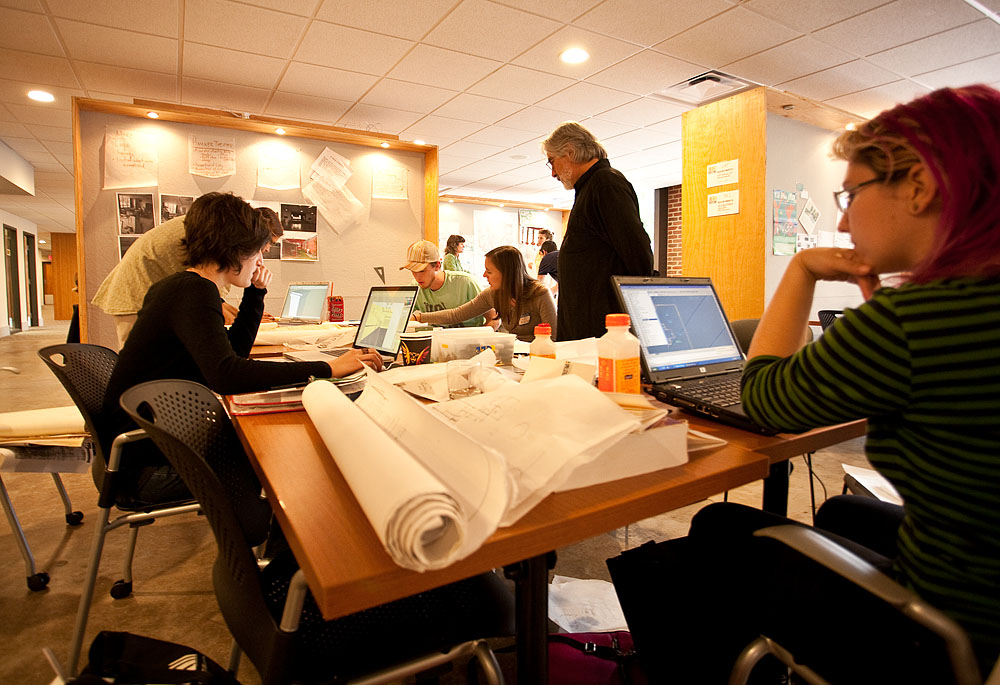
Last Friday morning I hauled my Epson 3800 and a bunch of ink and paper into Charlottesville to help out at the second annual Design Marathon (info here). My role was to provide printed output for the 11 design projects taking place. While things did get a little hectic towards the end of the day, everyone's patience and appreciation kept it from ever feeling like real work. I had a blast. I did have a couple opportunities to step away from my station and grab a few pictures of the event. By no means comprehensive, here's a gallery from the trenches...
Ames Room Project
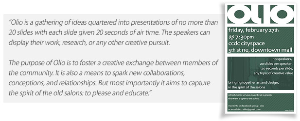
About a month ago I participated in an event in Charlottesville called Olio. For those unfamiliar with the event, it's best described by this quote from the Olio group Facebook page...
The opportunity to present motivated me to act on an old idea that I had not yet tried to execute because I had never been sure it would work out. I hoped that, succeed or fail, the idea and the process would make for an interesting enough topic. Rather than take the time to do a complete re-write, below is an edited copy of my slideshow.
My presentation will be about a personal photo project I’ve been working on recently. It’s unique for me in that it’s been more about the process than the end result because, as I’ll get into later, it could end up being a failed concept.
The project is a twist on an old optical illusion called the Ames room (Wikipedia link) -- which you’ve probably seen before. It’s a forced perspective illusion that plays with your mind’s understanding of visual clues in the scene to make objects appear out of scale. This example is typical in that is built on the comparison of more than one subject in the space. It’s usually shown with more than one person or object in the scene.
The effect is created by building a special room that has one corner stretched away from the viewer to add depth in a way that allows the space to appear normal from a single view point.
[these images illustrate how the Ames room illusion is usually implemented]
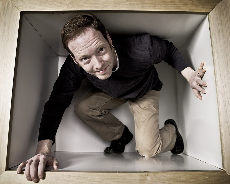
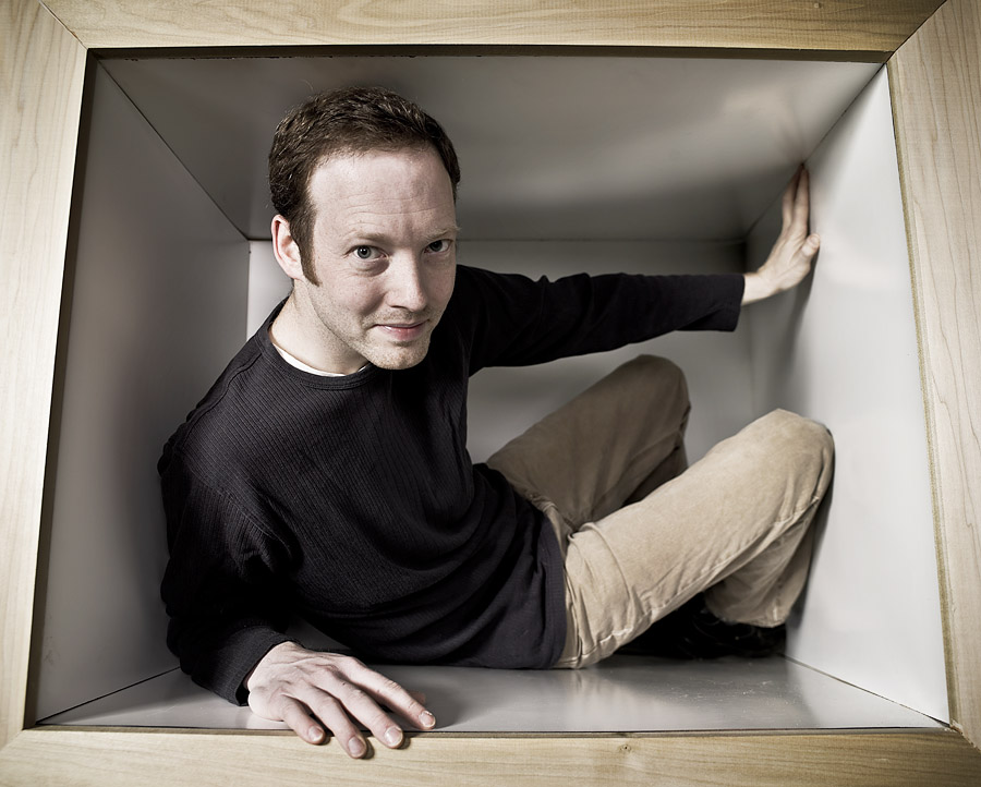
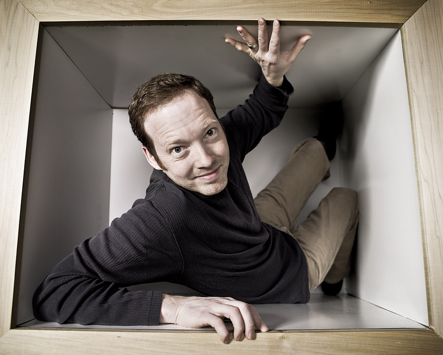
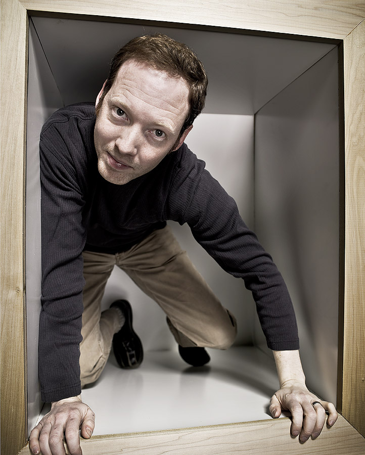
My idea was to build a smaller version of the ames room. Small enough that just a single person could fit in... and hopefully be posed or arranged in a way that causes an interesting visual distortion. At least an exaggerated wide-angle effect, but hopefully a look that plays with your mind’s eye a bit and makes a viewer want to take a second or third look.
Here’s where I’ll refer back to my earlier comment about how this could end up being a failed concept. To me, it’s a compelling idea - and seems to make sense, but the only way to know for sure is to build the set and take some pictures. Aside from the obvious set design issues of materials, and how to incorporate lighting, I had to deal with a few challenges unique to the nature of this project. Primarily I just didn’t know how big to make it.
I started with sketches and moved on to a small scale model. A lot of trial and error went into the model building stage - I rebuilt the model 3 or 4 times before settling on a combination of camera placement, lens selection, and set proportion that I thought would work well life-sized.
From there I threw together a quick full-sized mock-up that let me begin to put together some numbers and a real design plan. Along the way I discovered that the floor and ceiling couldn’t be flat planes. If you refer to the first example picture above, you only see the floor, ceiling, sides, and back of the room. In my idea, I wanted to be able to frame the front of the set -- which required connecting some extra dots.
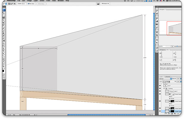
[These two images show the detailed floor plan and elevation I assembled in Photoshop (simply because it's the drawing app I know best and can work quickly in it). The measurements I came up with in this process were surprisingly accurate when applied to the final set.]
Finally I begin construction. You can see in this slide that I’ve begun to lay out the key elements that will define the space. I’ve highlighted in green the basic shape that I’m trying to represent.
This slide shows the completed floor. Notice how far the back-right corner has been stretched.
In this slide, the set is nearing completion. The illusion of a normal box shape is coming together well.
At this point the few samples I have are self-portraits so I’ll ask that you be kind. The first four thumbnails in the gallery below will link to larger images (by the way, if anyone out there knows how to have images show up in a post, but not in the gallery, let me know). I still consider this to be a work in progress, but so far the effect is working out well. I have some good ideas for continuing with this project and will post more results as soon I have something to offer.
